Ordinal palettes
Color schemes for ordered categories
The default cleanplots colors are nominal: they tell groups apart without implying any order. When the groups are ordered – survey responses from strongly disagree to strongly agree, levels of education, self-rated health from poor to excellent – the ordinal cleanplots# schemes use colors that run from light to dark, so the order of the colors follows the order of the categories.
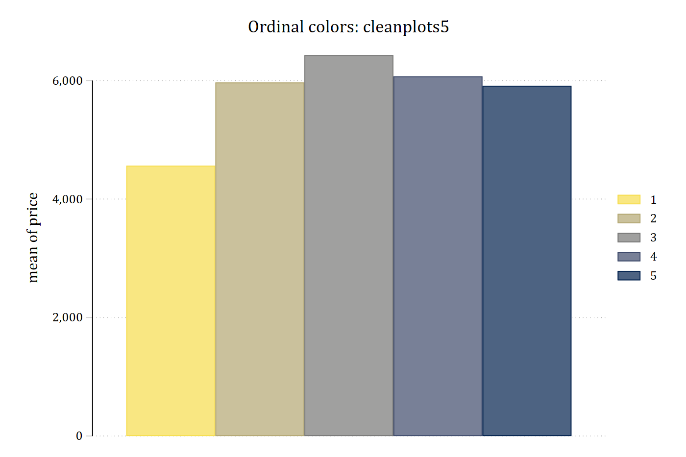
The same bar chart with the nominal palette and with cleanplots5, which matches the five ordered repair-record categories of Stata’s auto data:
sysuse auto, clear(1978 automobile data)graph bar price, over(rep78) asyvars scheme(cleanplots) ///
title("Nominal colors: cleanplots")
graph export "fig/ordinal-nominal.png", replace width(1400)file fig/ordinal-nominal.png saved as PNG formatgraph bar price, over(rep78) asyvars scheme(cleanplots5) ///
title("Ordinal colors: cleanplots5")
graph export "fig/ordinal-ordinal.png", replace width(1400)file fig/ordinal-ordinal.png saved as PNG format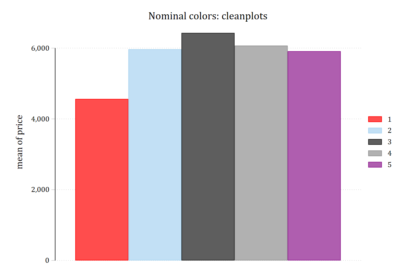
Choosing a scheme
There are four versions, each available for every number of categories from 2 to 15:
| Scheme | Palette | Colors run from |
|---|---|---|
cleanplots# |
Cividis | light yellow to dark navy |
cleanplots#r |
Cividis, reversed | dark navy to light yellow |
cleanplots#v |
Viridis | light yellow through green and blue to dark purple |
cleanplots#vr |
Viridis, reversed | dark purple to light yellow |
Replace # with the number of ordered categories in your graph. The number is a count of categories, not a version number or a color intensity: cleanplots5 is for five ordered groups, and cleanplots7vr is for seven ordered groups in reversed viridis colors. Apply a scheme to a graph with the scheme() option, as in the bar chart above.
Which version to use:
- Cividis (
cleanplots#) is the recommended default. It is a variant of viridis designed so that readers with red-green color blindness see essentially the same colors as everyone else. - Viridis (
cleanplots#v) moves through more hues – yellow, green, blue, and purple – so neighboring categories are easier to tell apart in color. - Reversed (
cleanplots#randcleanplots#vr) puts the darkest color first. Use it when you want the first category to be the darkest. Stata has no option to reverse the colors of a scheme, so choose the reversed scheme instead. - Match the number to your categories. If a graph has more series than the scheme has colors, the colors start over from the first color, while the line patterns and marker symbols keep changing.
The ordinal schemes inherit all layout, sizing, and legend settings from the main cleanplots scheme, and each series still gets its own line pattern and marker symbol. Bars and areas use softer versions of the colors, as in the main scheme.
The colors
Each scheme runs from the light end of its palette to the dark end, so the more categories a scheme has, the smaller the steps between neighboring colors. The colors of the ordinal schemes for 3, 4, 5, 6, 7, 9, and 15 categories are also available by the scheme’s name in Ben Jann’s colorpalette command (from the palettes package on SSC). The cividis and viridis schemes for 3, 5, 9, and 15 categories:
colorpalette, span : cleanplots3 / cleanplots5 / cleanplots9 / cleanplots15
graph export "fig/ordinal-palette-cividis.png", replace width(1400)
file fig/ordinal-palette-cividis.png saved as PNG formatcolorpalette, span : cleanplots3v / cleanplots5v / cleanplots9v / cleanplots15v
graph export "fig/ordinal-palette-viridis.png", replace width(1400)file fig/ordinal-palette-viridis.png saved as PNG format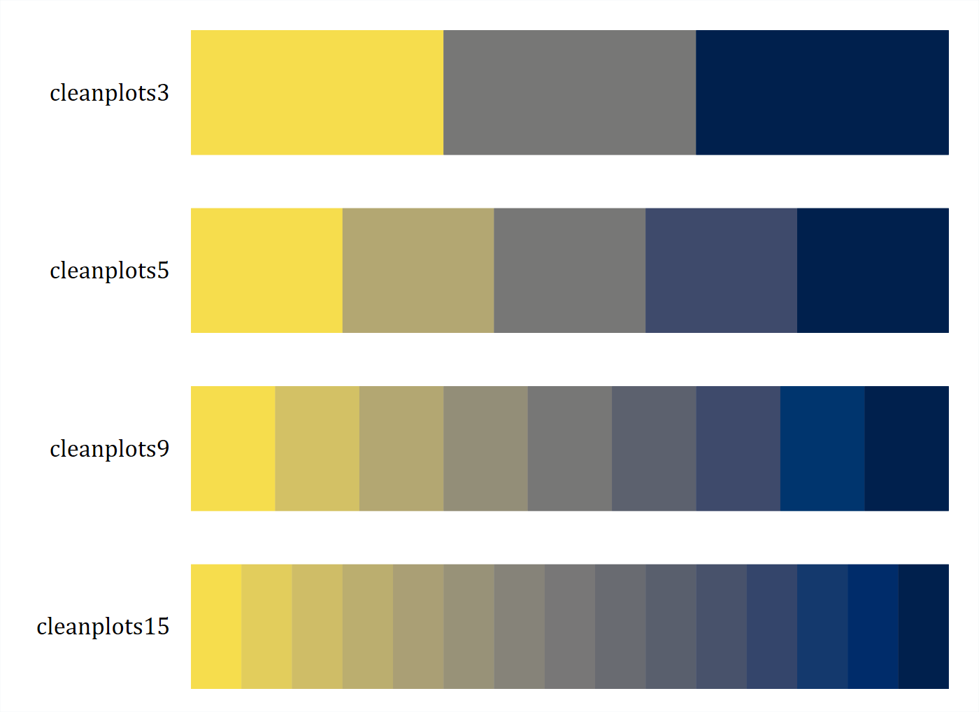
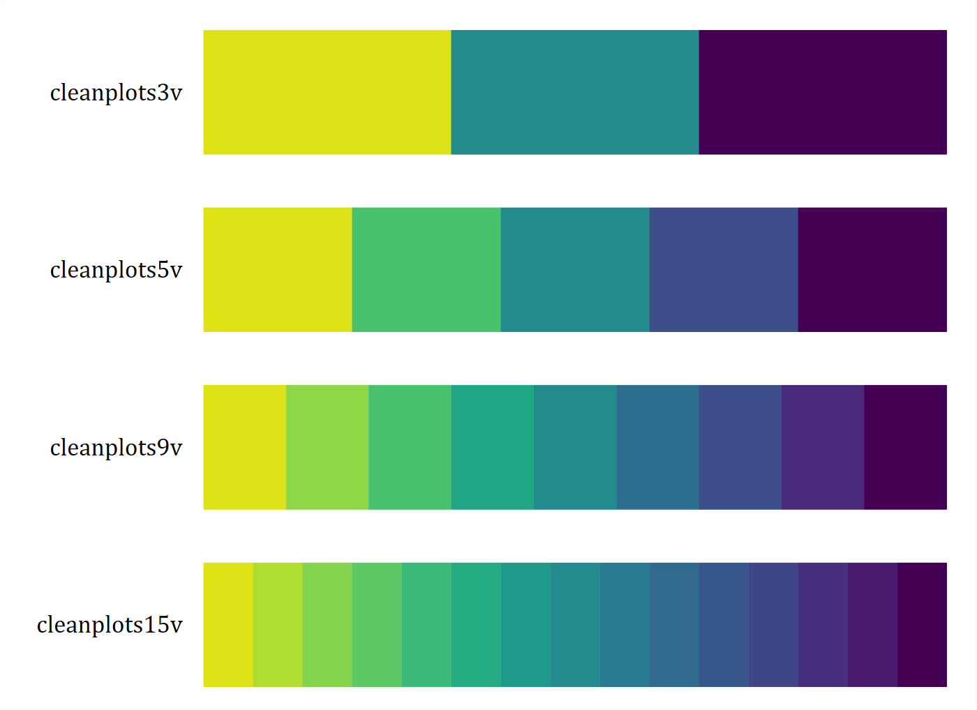
With many categories, neighboring colors become hard to tell apart, so clear labels, line patterns, and marker symbols matter more.
Palette and direction
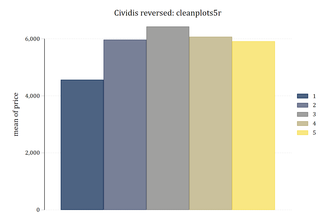
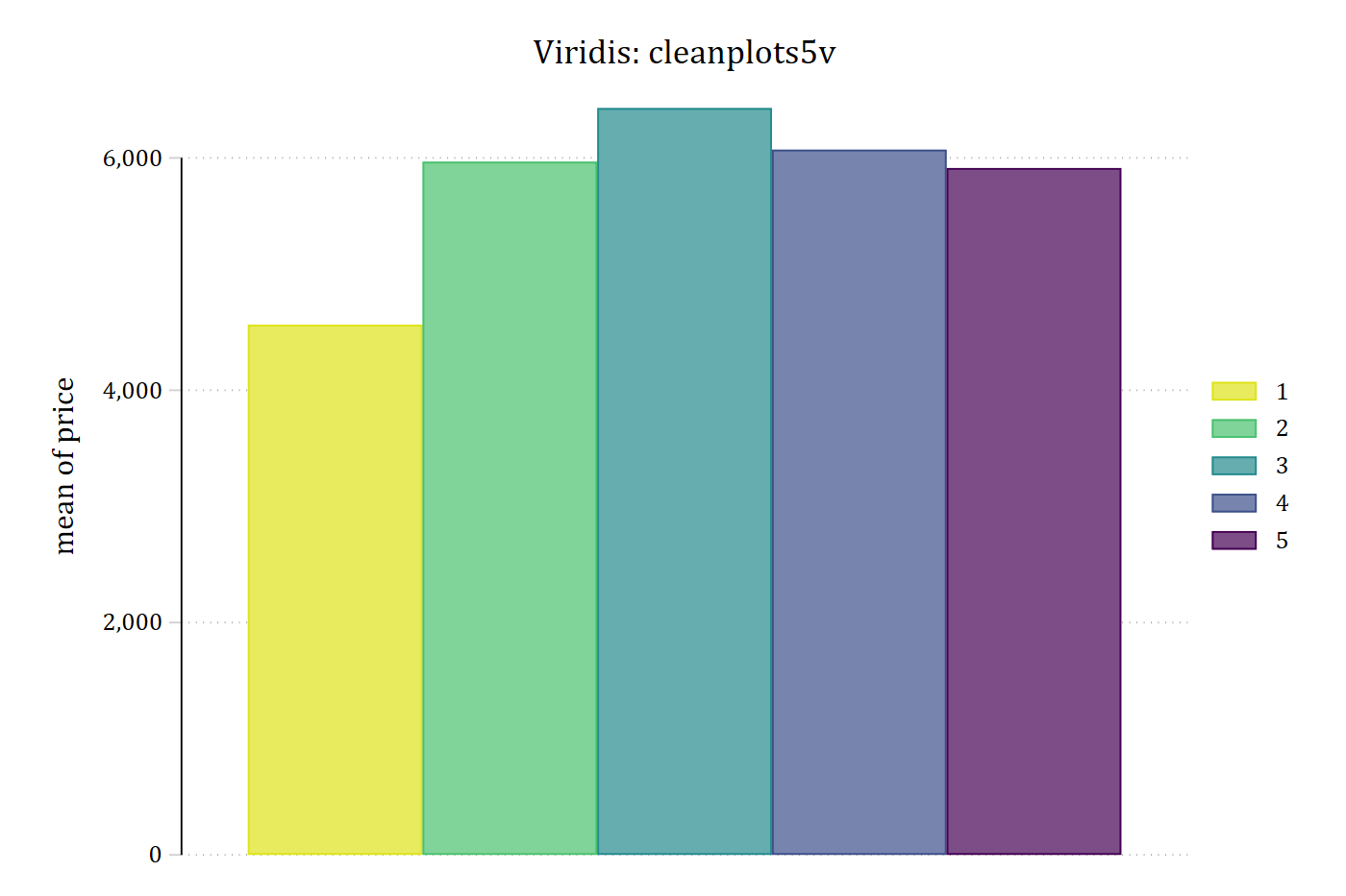
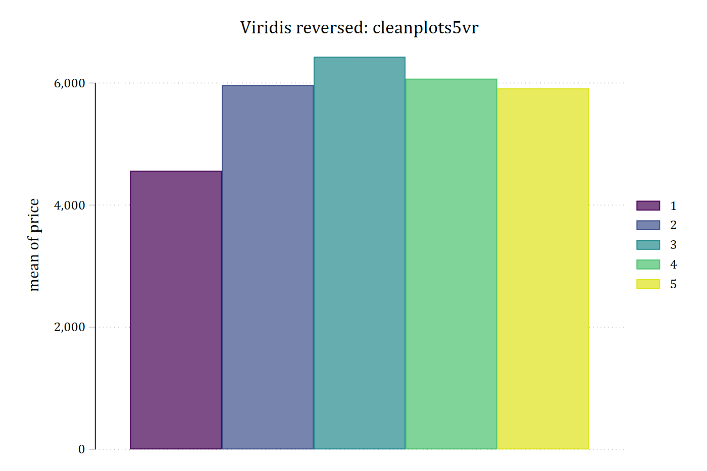
The repair-record bar chart in all four versions:
sysuse auto, clear(1978 automobile data)graph bar price, over(rep78) asyvars scheme(cleanplots5) ///
title("Cividis: cleanplots5")
graph export "fig/ordinal-bar-5.png", replace width(1400)file fig/ordinal-bar-5.png saved as PNG formatgraph bar price, over(rep78) asyvars scheme(cleanplots5r) ///
title("Cividis reversed: cleanplots5r")
graph export "fig/ordinal-bar-5r.png", replace width(1400)file fig/ordinal-bar-5r.png saved as PNG formatgraph bar price, over(rep78) asyvars scheme(cleanplots5v) ///
title("Viridis: cleanplots5v")
graph export "fig/ordinal-bar-5v.png", replace width(1400)file fig/ordinal-bar-5v.png saved as PNG formatgraph bar price, over(rep78) asyvars scheme(cleanplots5vr) ///
title("Viridis reversed: cleanplots5vr")
graph export "fig/ordinal-bar-5vr.png", replace width(1400)file fig/ordinal-bar-5vr.png saved as PNG format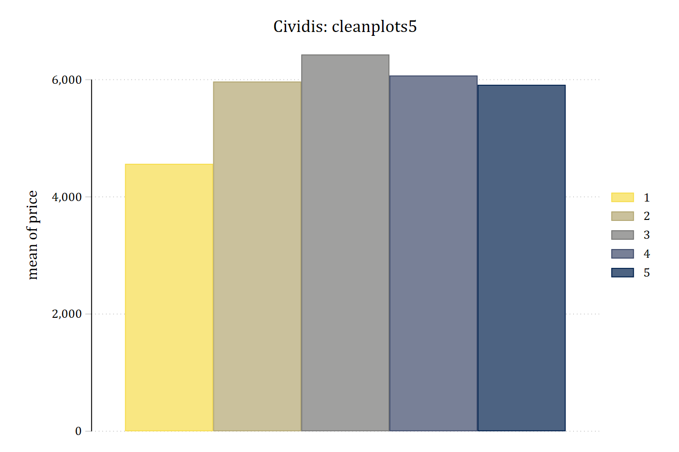
Lines and markers
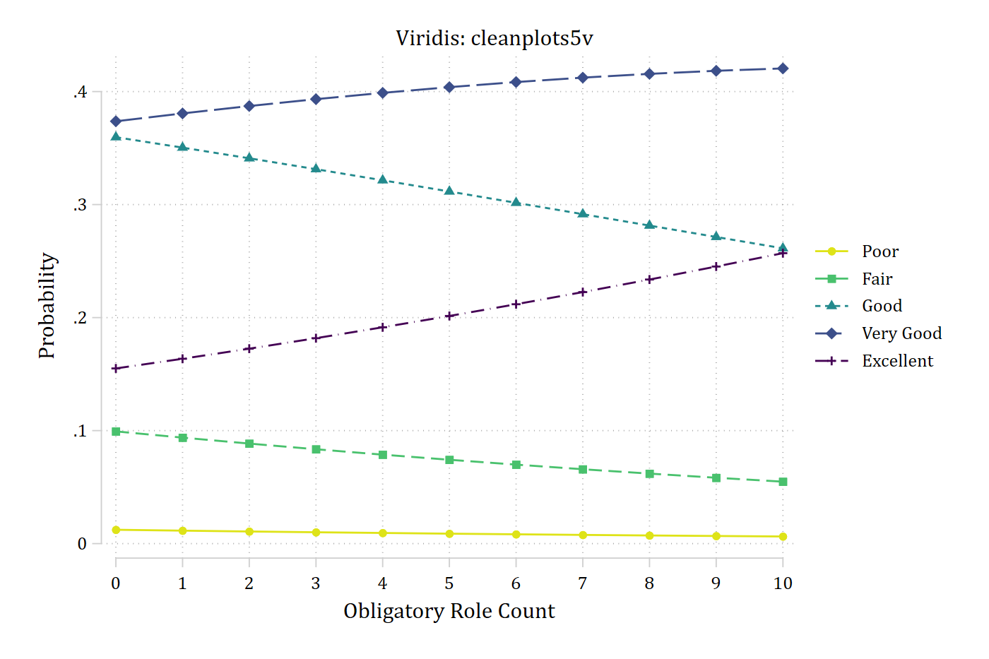
The ordinal palettes work for lines and markers as well as bars. Self-rated health, from poor to excellent, is an ordered outcome. The predicted probability of each category from an ordinal logit model, with cleanplots5 and cleanplots5v:
use "https://tdmize.github.io/data/data/addhealth4", clear(addhealth4_dmv.dta | Add Health Wave IV | DMV Workshop)
. quietly ologit health orole vrole i.woman age income i.race i.educ
quietly margins, at(orole=(0(1)10)). marginsplot, noci scheme(cleanplots5) title("Cividis: cleanplots5") ///
legend(order(1 "Poor" 2 "Fair" 3 "Good" 4 "Very Good" 5 "Excellent"))Variables that uniquely identify margins: orolegraph export "fig/ordinal-ologit-5.png", replace width(1400)file fig/ordinal-ologit-5.png saved as PNG formatmarginsplot, noci scheme(cleanplots5v) title("Viridis: cleanplots5v") ///
legend(order(1 "Poor" 2 "Fair" 3 "Good" 4 "Very Good" 5 "Excellent"))Variables that uniquely identify margins: orolegraph export "fig/ordinal-ologit-5v.png", replace width(1400)file fig/ordinal-ologit-5v.png saved as PNG format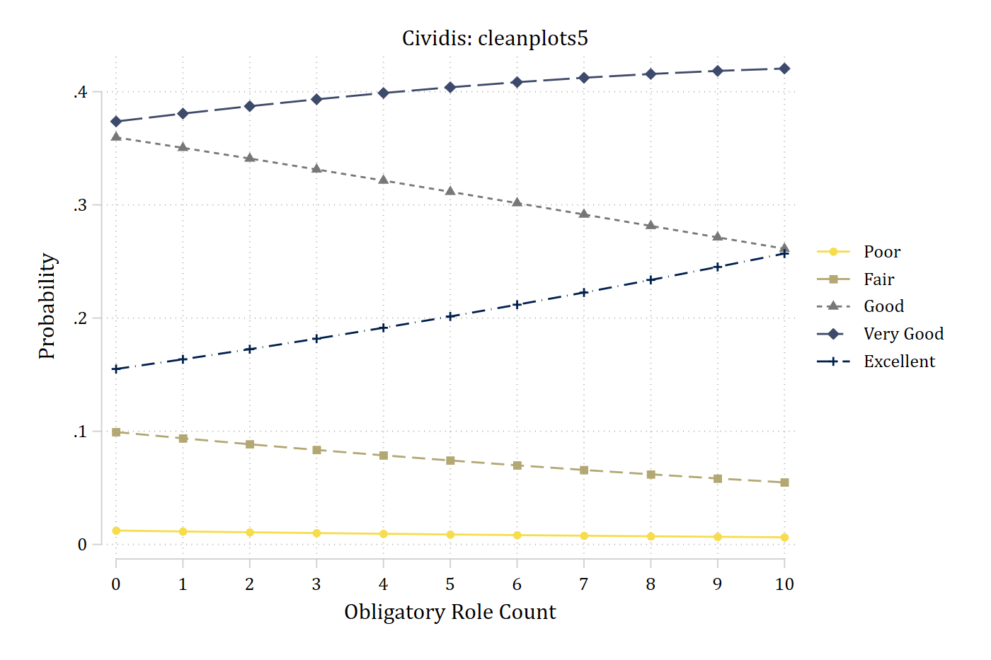
Printing in black and white
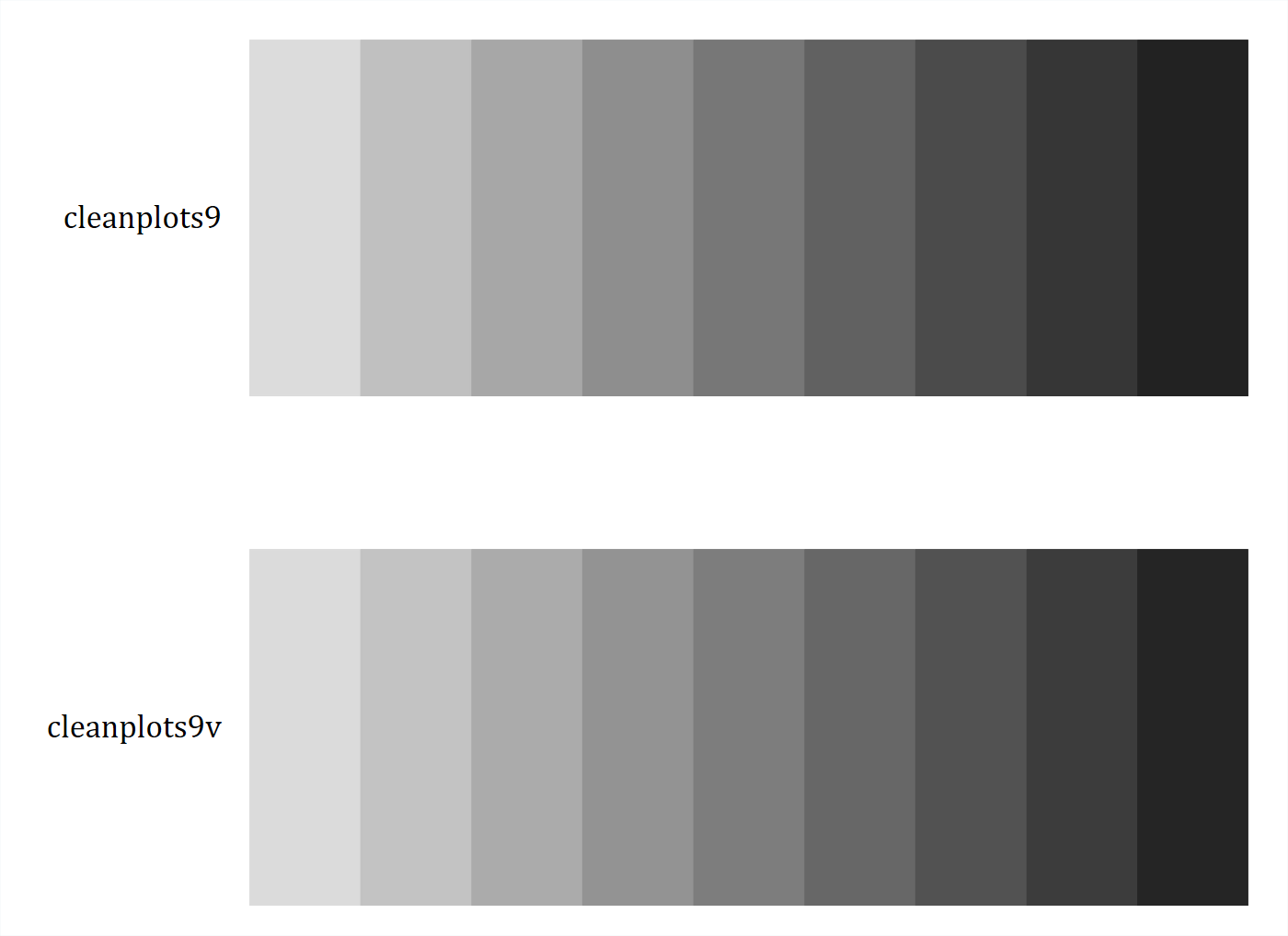
Because the colors run from light to dark, the order of the categories carries over to grayscale. The nine-color cividis and viridis schemes in color and in grayscale:
colorpalette, span : cleanplots9 / cleanplots9v
graph export "fig/ordinal-9-color.png", replace width(1400)
file fig/ordinal-9-color.png saved as PNG formatcolorpalette, gscale span : cleanplots9 / cleanplots9v
graph export "fig/ordinal-9-gray.png", replace width(1400)file fig/ordinal-9-gray.png saved as PNG format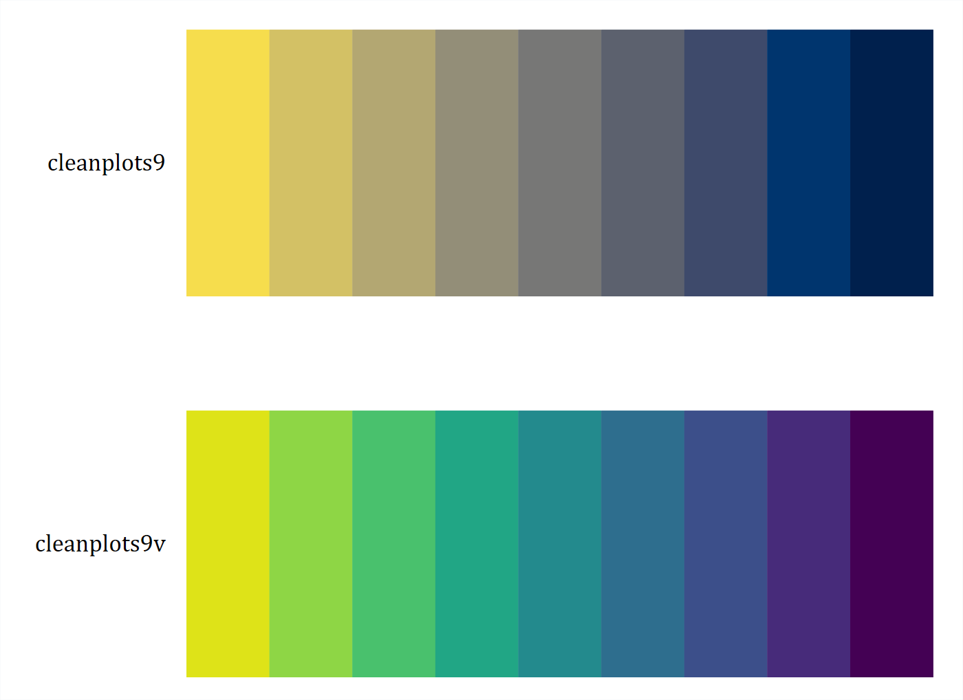
Credit for the colors
If you use the ordinal schemes, please credit the palette you used: cividis (Nunez, Anderton, and Renslow 2018) or viridis (van der Walt and Smith 2015).
References
Nunez, Jamie R., Christopher R. Anderton, and Ryan S. Renslow. 2018. “Optimizing Colormaps with Consideration for Color Vision Deficiency to Enable Accurate Interpretation of Scientific Data.” PLOS ONE 13(7): e0199239.
van der Walt, Stéfan, and Nathaniel Smith. 2015. “matplotlib colormaps.” https://bids.github.io/colormap/